Hey everyone! I present to you all another Skillshare project. I’m starting to really love Skillshare because it is giving me a refresher of things that I learned at the university while also pushing me out of my comfort zone with a wide range of projects. This particular one really tested my skills.
![]()
In the beginning, I created a mind map for this project. I tossed around everything from cities, my favorite hobbies, and my favorite books. But, I kept going back to the idea of drinks, so I played around with a few drink ideas. I ended up settling on coffee because it’s a huge part of my life. Some days I feel like I can’t function without my daily dose.

After creating the mind map I started sketching out idea for the icons. I wanted to illustrate what was in each beverage, so I decided to make the coffee cups cut out. At this point I hadn’t decided what shapes or even which cups to use. I also had no idea which ribbons I was going to choose or even if I was going to have any at all.

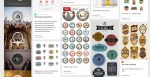


After I scanned in the sketches I started going through Dribble and Pinterest to create mood boards. I’ve provided a couple of screenshots of each mood board in addition to the links above.
I’m a big fan of vintage design. There’s just something about it that draws me in. Many of these remind me of Williams-Sonoma’s design work which I adore.

I scanned in my sketches and have been playing around with the style of the coffee cup as well as the circle that it sits in. I was still really feeling the to-go coffee cup, but I hadn’t finalized anything yet. In the end I decided to sit on it for a day or two.

When I came back to the project, I had my head in the game. I decided to use the to-go cups since that was what my gut was telling me. I was still playing around with the color palette as you can see above.
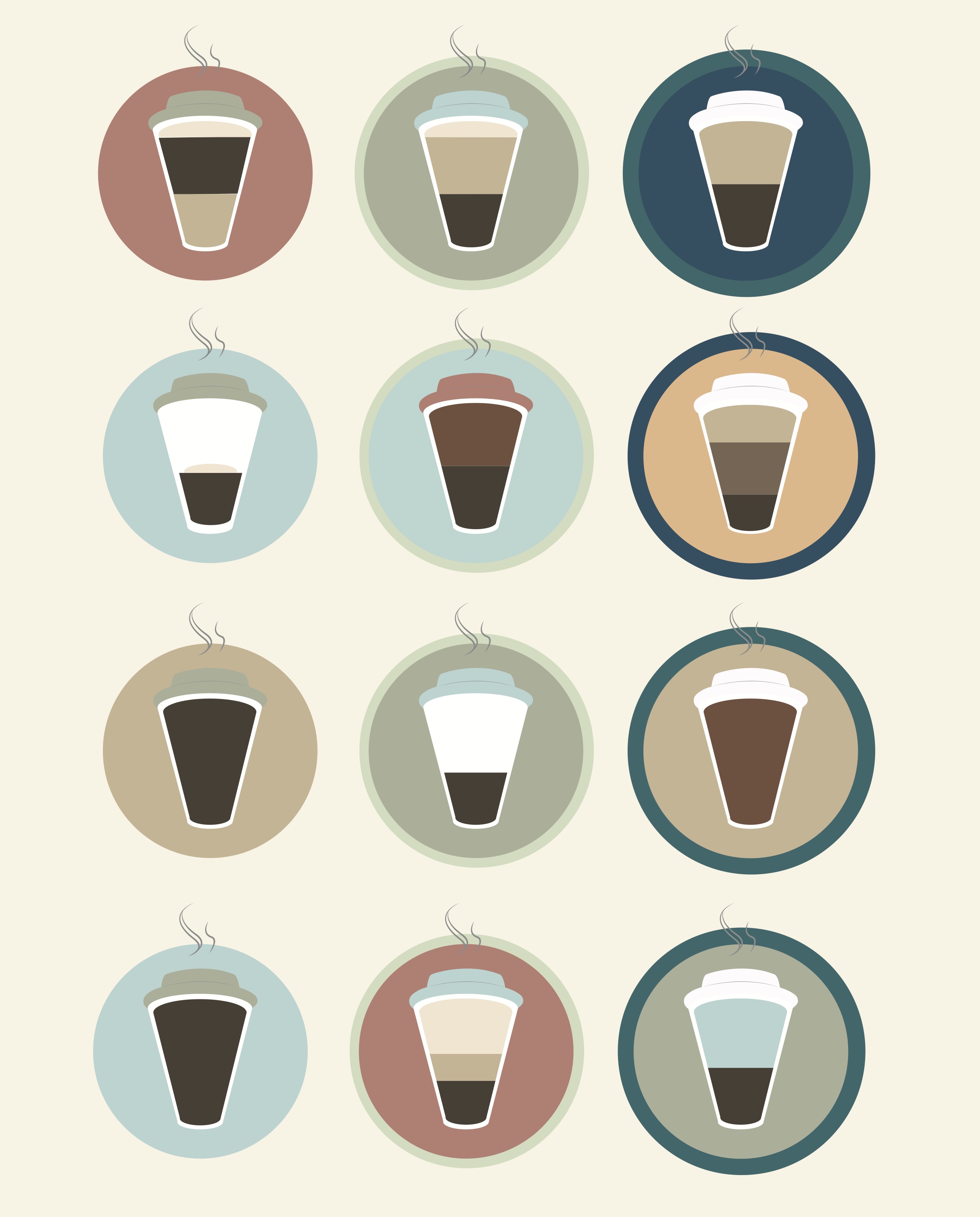
The end result:

I decided to go with a lighter color palette than what I originally started with and I believe it made it a bit more fun to look at. By incorporating some of the tips and tricks the instructor gave, I was able to add some dimension to these flat illustrations. I really like how they turned out. It’s informative, but not boring. There is a clear differentiation of the ingredients in each cup and they aren’t hard to figure out. I wanted to make sure that they were very easy to read.
Notes: This project brought out the perfectionist within me. I used my guides quite often. I uploaded the final project 4-5 times on the Skillshare site before finally sharing it because I kept going back and forth tweaking little things. I really enjoyed working on this and have a list going of other similar projects I’ll be doing in the future.
Let me know what you all think!

