Hey everyone! I figured it was about time that I let you all in on some of the things I’ve been doing on the design side. I signed up for Skillshare and have begun taking a variety of classes. I’m what you would call a “lifetime student.” I love learning and I figured Skillshare would help me improve upon some skills without having to go back to college. I also figured that this was the best way to push me out of my comfort zone and get me to actually complete projects.
The first Skillshare class I took was called “Vintage Illustration: Back to the Future” by Linda Eliasen. It focuses around creating a vintage postcard that represented the future but looks like it was designed by the past.
In this class I had to do quite a bit of research into the Atomic age. This was during the mid-century when everyone was obsessed with space and the future. After sketching and choosing the cities I wanted to represent in the postcard, I scanned my sketches into illustrator and begun playing around with the compositions. I had a pretty set color palette that I used for all three. I just played around with the opacity to get different shades.
Here were the results:
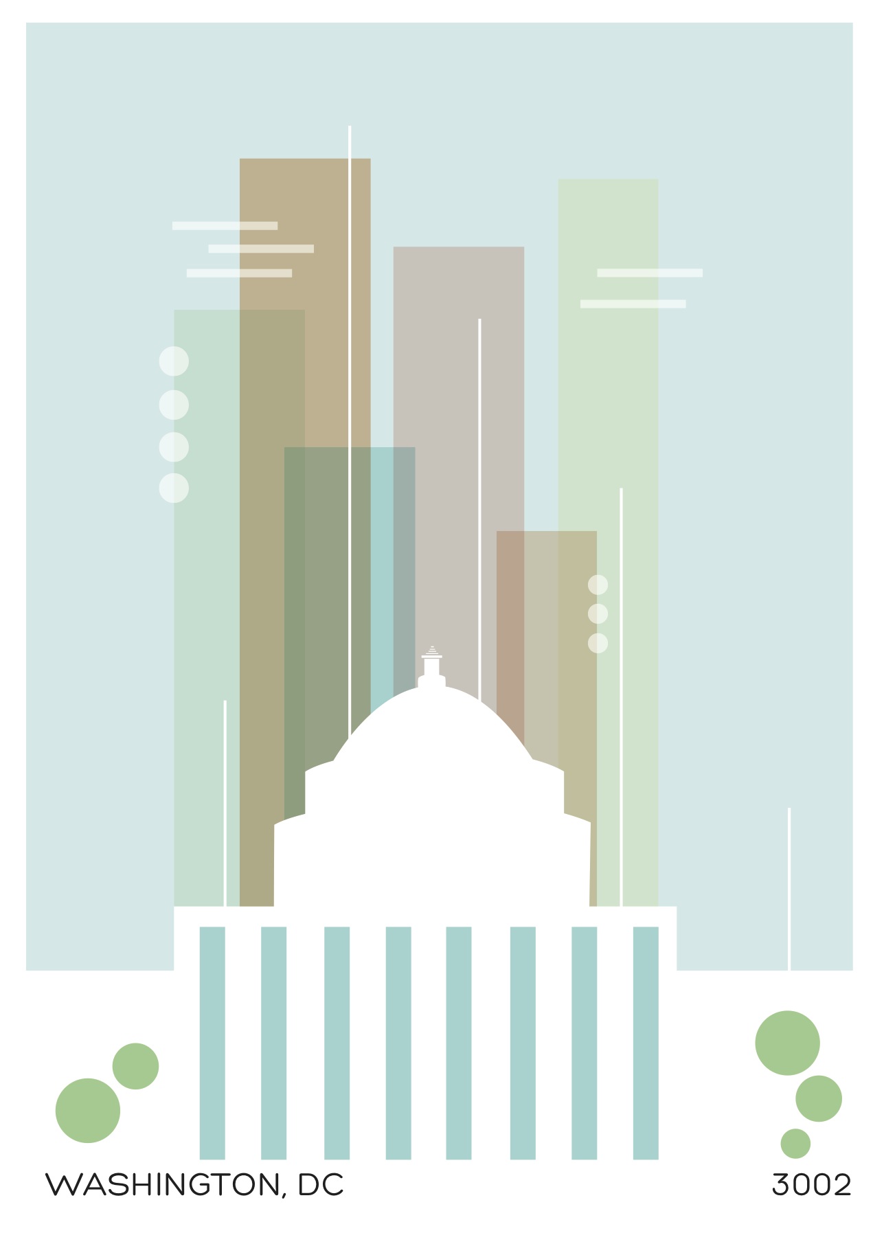
I wanted the DC postcard to be a balance between light and dark. I didn’t want a bright sunny day, but I also didn’t want a nighttime scene. I ended up settling on a foggy/cloudy afternoon that was right after an earlier rainstorm.
I also wanted it to be very minimal without a lot of clutter. The style we were going for used a lot of simple shapes and I took advantage of that. The building was the focal point so I kept it solid while lowering the opacity for the background buildings. I didn’t want it to be over the top but still interesting to look at.

For the Detroit postcard, I settled on the Mustang because it’s such an iconic image for the city. This particular postcard was really inspired by the Jetsons. I enjoyed the Jetsons growing up so I was really digging this one. I wanted to play up the idea of hoover cars and I figured since Detroit is in such a desolate state right now, there probably wouldn’t be much on the ground to look at, so I left that out.

 For the St. Louis one I decided to stick with the famous arch. I just played around with the composition until I liked it. I wanted the city and arch to play off of one another or connect in some way so I kept that in mind. I also played around with the colors until I felt that it conveyed what I wanted it to. It has a very retro/futuristic feel to it like the other two, but more emphasis on the environment. I’m very happy with it.
I may get them printed and have them up for sale on my site. We’ll see.
Thank you all for checking it out.


I see a lot of interesting content on your page.
You have to spend a lot of time writing, i know how to save you a lot of time, there is a tool that creates unique, SEO friendly articles in couple of seconds, just type in google – k2 unlimited content